Previous post

Don’t get me wrong, I LOVE LOVE LOVE bold, beautiful colors. But nothing gets me all giddy like the perfect shade of GREY. (Insert Shades of Grey joke here.)
At face value, grey is… grey. Unemotional. Not black. Not white. But somewhere in the middle. Color psychologists would say, grey is dreary and could even stifle one’s creativity if used on a wall.
Thank goodness no one cares.
There’s a reason grey has been all the rage the last few years. You simply can’t go wrong using it in your home. And here’s why, in my humble opinion:
Granted, you have to find the right shade of grey, which is totally easy, right?! Cuz you know, there are only ONE MILLION shades. There’s brown-ish, green-ish, blue-ish, white-ish. How ’bout what-the-heck-ish?!
If I can give you any advice, it’s this: Look to other homes, check out any open houses you can, gawk at model home tours, scour pinterest and draw your inspo that way to identify the “right” grey for you and your home. Or simply rely on your instincts. What feels right? Just remember (and this is obvious, but worth mentioning), grey has so many nuances that the “real” color may not show up well online. When in doubt, visit a paint store in person.
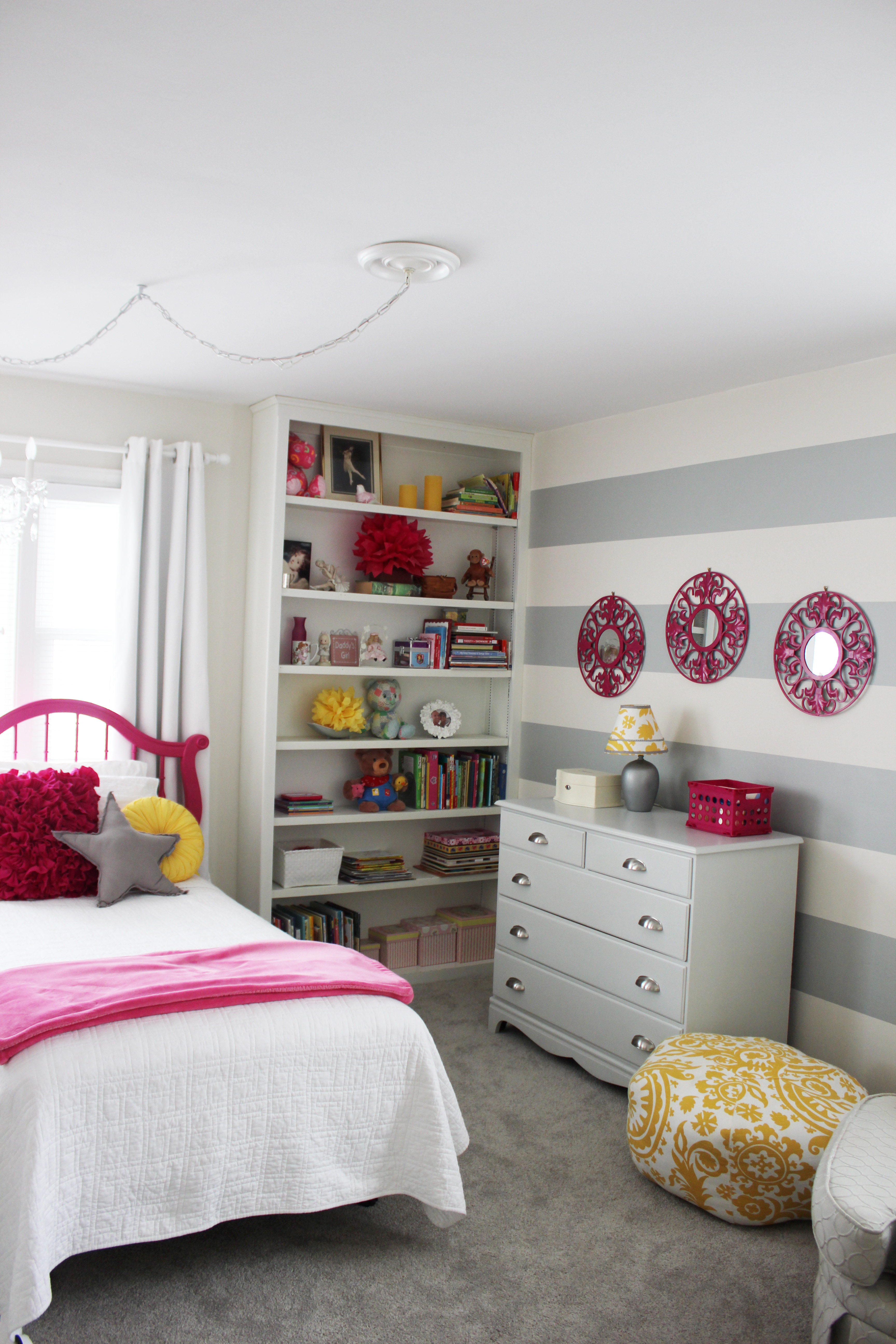
Or rather, everyTHING. Grey is such a neutral goddess, it makes pop-worthy items pop.
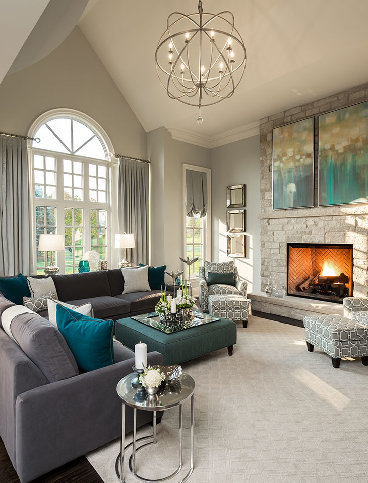
Source: Homedit
It’s not a fad. It’s not the next “it” color. Grey is timeless. So when everyone else is repainting their cheetah print walls (no, not really probably gonna be a thing, but you get my point), you will be sitting in your gorgeously-grey haven, grinning from ear to ear.
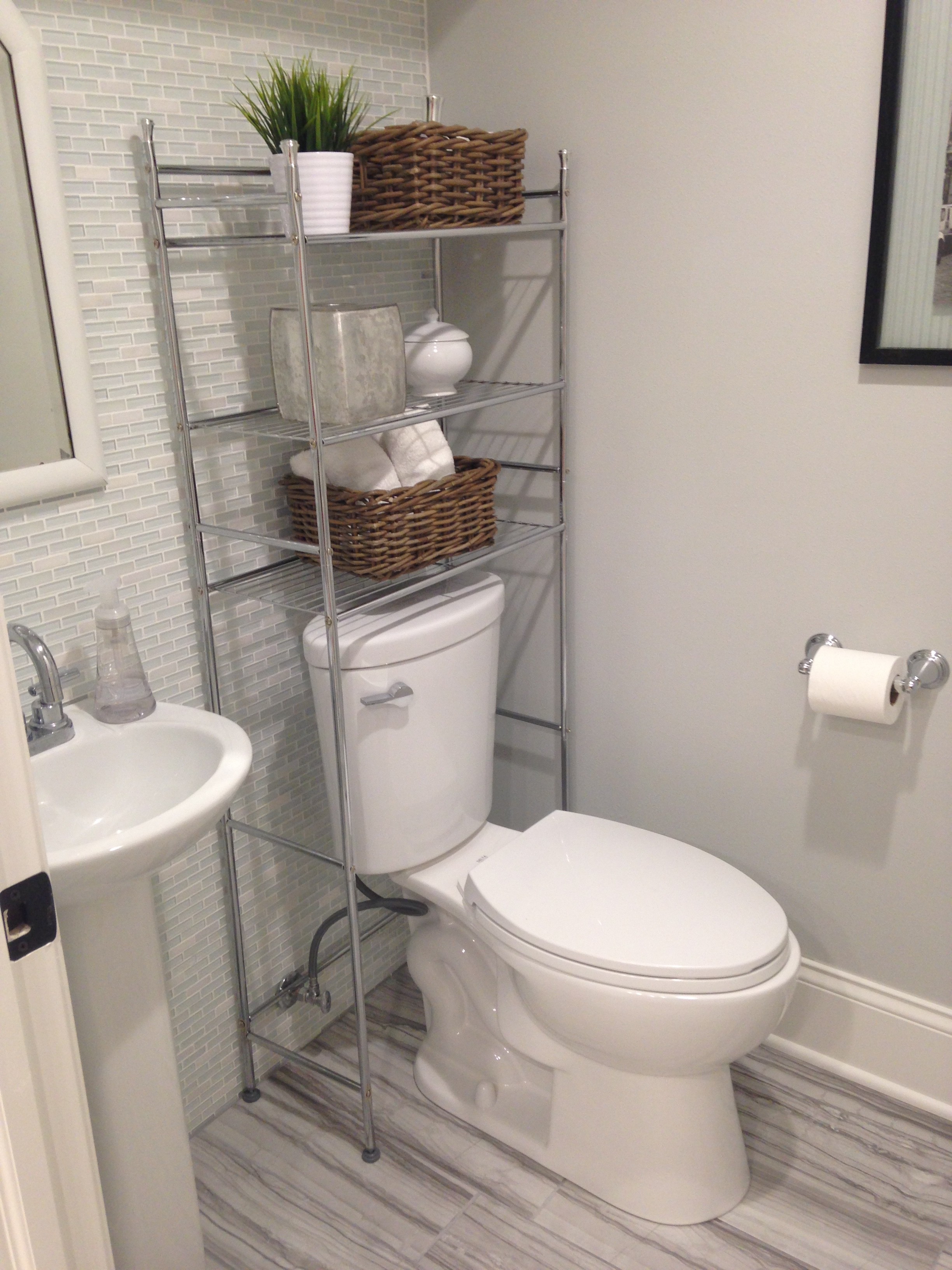
I’m not sure how anyone could argue with this one. Check out our use of grey/blue tiles & grey paint in our basement bathroom, and grey subway tiles in our newly renovated kitchen. C.H.I.C. (If I do so say myself!)
It can go whichever way you want it to. Warm greys are yellow-based. While cooler greys are blue based. You may want to keep this in mind depending on the room you’re decorating and the immediate “mood” you want it to exude.
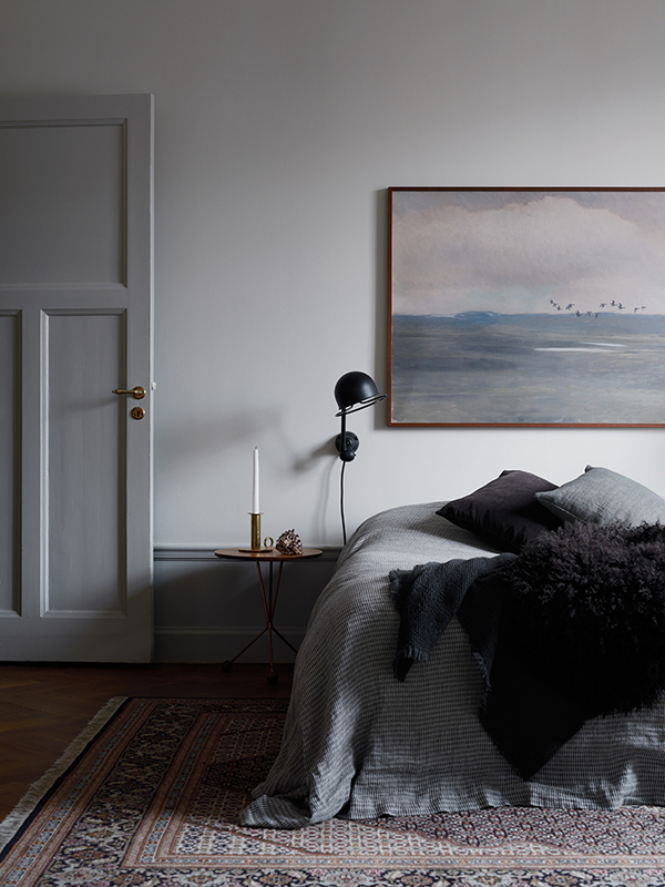
Source: My Unfinished Home
I typically think of grey as a complement to silver (obvious? yes.), but check out how beautiful it can be when paired with gold.
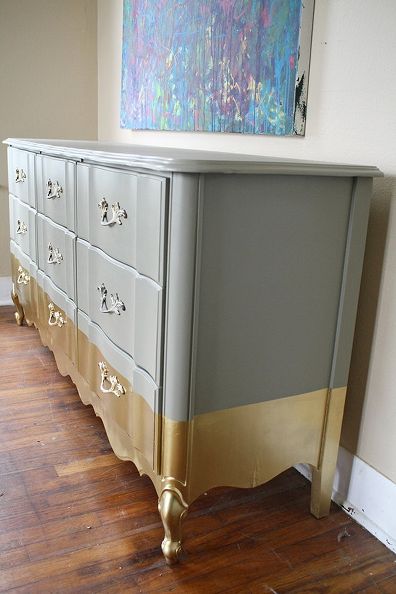 Source: Home Talk
You can incorporate it in your wall color, tile, wood, furniture, bed linens, whatever. Grey is so versatile, you simply cannot go wrong.
Modern, eccentric, farmhouse chic? Whatever your style, grey can do it justice.
Source: Period Ideas
Source: Decouvrir Design
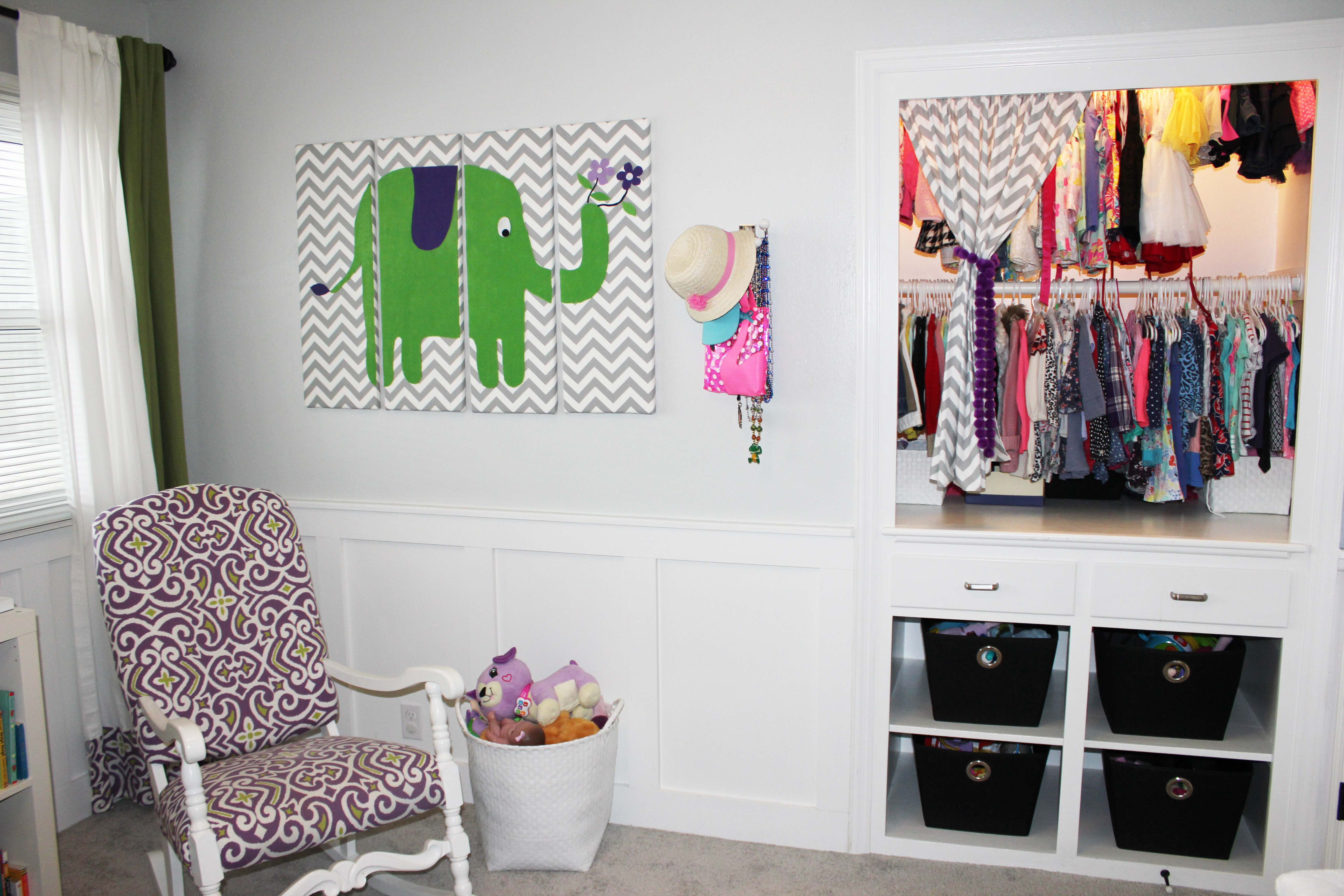
Below are a few examples of where I use grey in my home (not including my kitchen you already viewed above), and the swaatch to go with it. Because greys are so so hard to get right. I’m here to help.
Where can I purchase the grey rug in the first photo? Looked everywhere!
A beautiful grey what is the name of the this grey?
4 Comments